Tips for Choosing Calm Colors for Your Home
Creating a serene and relaxing environment in your home starts with choosing the right colors. Calm colors have the power to transform your living spaces into tranquil retreats, reducing stress and promoting well-being. Whether you’re repainting a single room or redecorating your entire home, selecting colors that radiate peace can make a big difference.
In this post, we’ll guide you through tips for choosing calm colors that suit your style and space, helping you create a harmonious atmosphere you’ll love coming back to.
Why Choose Calm Colors?
Calm colors are typically soft, muted shades that are easy on the eyes and evoke feelings of relaxation. These colors can help:
– Reduce tension and anxiety
– Promote restful sleep when used in bedrooms
– Encourage conversation and comfort in living areas
– Create a balanced and cohesive look throughout your home
Common calm colors include soft blues, gentle greens, muted grays, and warm neutrals. But the best choice depends on your preferences and the atmosphere you want to create.
Tips for Choosing Calm Colors
1. Understand the Mood You Want to Set
Start by thinking about how you want to feel in each room. Do you want a peaceful sanctuary, a cozy nook, or a refreshing space? Different colors set different moods:
– Blue: Known for its calming effects, blue is reminiscent of sky and water, promoting a sense of tranquility. It’s ideal for bedrooms and bathrooms.
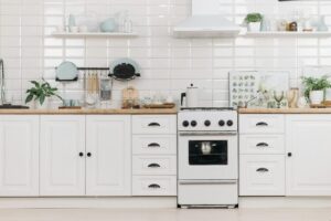
– Green: Symbolizing nature and growth, green can feel refreshing and balanced. Perfect for living rooms and kitchens.
– Beige and taupe: Warm neutrals bring warmth and softness without overpowering. Great for almost any space.
– Soft gray: A versatile neutral that feels modern and calming, especially when paired with natural light.
2. Consider the Lighting in Your Home
Natural and artificial lighting can greatly affect how a color looks:
– Rooms with lots of natural daylight tend to show colors more vividly. Softer shades work well here to balance brightness.
– South-facing rooms receive warm sunlight, making colors appear warmer. Cool tones like soft blues and greens can help balance this.
– North-facing rooms get cooler, dimmer light, so warm neutrals or light pastels can add warmth.
Test paint samples on your walls and observe how they look at different times of the day before making a decision.
3. Use a Color Palette to Create Harmony
Choosing one calm color for the entire house can feel monotonous, but too many colors can become chaotic. Using a coordinated color palette helps maintain harmony:
– Select a primary calm color for main walls.
– Choose complementary accent colors for smaller areas like trims, doors, or furnishings.
– Consider using varying shades of the same color to add depth while keeping things cohesive.
Apps and color tools from paint brands can help you build palettes that match your taste.
4. Mix Textures and Materials to Enhance Calmness
Color alone doesn’t create calm—texture plays a role too.
– Soft fabrics like cotton and linen in calming tones contribute to a cozy feel.
– Natural materials like wood, stone, and woven baskets add warmth and grounding.
– Matte finishes for paint prevent glare and offer a softer appearance compared to glossy paint.
Combining color with texture makes rooms inviting and soothing.
5. Limit Bold or Bright Colors to Accents
Bright or bold colors can energize a space but they aren’t typically calming. However, using them sparingly for accents can add interest without disrupting serenity.
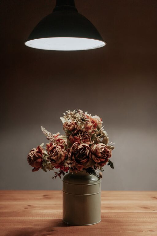
– Small accessories like cushions, artwork, or vases in brighter hues.
– Accent walls in muted versions of bold colors.
– Colorful rugs and throws that introduce cheer without dominating the room.
The key is balance – calm colors set the stage, and accent colors add personality.
6. Keep Your Personal Preferences in Mind
While there are general psychological effects of colors, it’s important to choose colors that feel right for you. A color that promotes calm for one person might not work as well for another.
– Gather inspiration from magazines, online galleries, and showrooms.
– Create mood boards with samples and photos to visualize combinations.
– Don’t rush; live with your color samples for a few days before finalizing.
Your home should reflect your personality as much as it provides comfort.
Bonus: Calming Color Ideas by Room
– Bedroom: Soft blues, lavender, muted sage, or warm beige promote relaxation and restful sleep.
– Living Room: Warm neutrals combined with soft greens or dusty blues encourage calm conversation.
– Bathroom: Light blues, seafoam greens, or pale grays evoke freshness and cleanliness.
– Kitchen: Balanced neutrals with subtle green or blue accents create a peaceful cooking environment.
Final Thoughts
Choosing calm colors for your home is a wonderful way to create peaceful spaces that nurture relaxation and comfort. By understanding the mood you want to create, considering the lighting, coordinating your color palette, and balancing textures, you can transform your home into a soothing haven.
Take your time, test colors, and most importantly, choose colors that make you feel good. With these tips, you’re well on your way to designing a home filled with calm and beauty.
Happy decorating!